Settings
The Video Particle template is a full width slider. This means the slider occupies the available horizontal space on the website. In other words, it fills the full browser width. Full width sliders look great on any device, but they shine best on large monitors. The more space they have, the more cool effects they can show.
The slider is actually a Block. Blocks are special kind of sliders, because they’re not actually sliders. In fact, the Block type can only display one slide. So, Blocks are sections on your site, what you can create with Smart Slider 3.
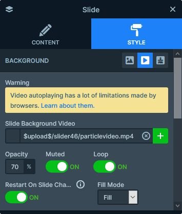
When you check the template, one of the first things you’ll notice is that it has a video. In the Free version of Smart Slider 3 you can only use videos from YouTube or Vimeo. But in Smart Slider 3 Pro you can use your own MP4 videos as well! In fact, you can set your MP4 videos as the background of your slide.

Layers
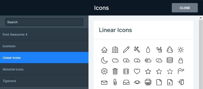
The most special layer on the Video Particle slider is the icon layer. It’s an exclusive layer you can find in Smart Slider 3 Pro, and it allows you to add awesome icons to your slides. You can select the icon you want to show from the following libraries: Font Awesome 4, Icomoon, Linear icons, Material icons, Typicons.

The block also has a CTA button, which makes it the perfect choice as a header slider for your site.
Animations
Apart from the background video, the Video Particle template has another interesting animation. It’s the Particle Effect, which is a cool effect in Smart Slider 3 Pro to enrich your sliders with. The Particle Effect uses a bunch of tiny dots to create stunning animations. The dots move around, and they can also interact with each other, and the mouse cursor, too. On this template moving the cursor enlarges the dots, creating something spectacular.

There’s another animation, which is a lot less subtle than the Particle effect. It’s the Layer Animation, what we added to the Column to bring it in.
Layout
The layout of the Video Particle slider is quite simple. It has a single row, which contains just a few layers. Creating such layout is also very simple. First, you need to set a maximum with on the Content layer. Next, align it to the right. Third, add a row and set a background color to increase legibility. Finally, add your layers and configure them to your liking.
Responsive
Smart Slider 3 is a responsive slider for WordPress and Joomla. On this template, we didn’t actually have to do any kind of responsive adjustments. In fact, everything looked perfect immediately. This happens because of the special layer positioning Smart Slider 3 has. At other slider plugins, you can only position layers absolutely. As a result, the layers have no connection to each other, and they can overlap. Also, the text sizes change based on the width of the browser. Therefore, they shrink with the browser, and can become too tiny to read.
Smart Slider 3 uses a different positioning technique, what we call Default positioning. Default positioned layers can’t overlap each other, because they’re positioned relatively. As a result, when a text breaks into more lines, it makes space for itself by pushing down the following layers. Additionally, Default positioned layers have fix font sizes for each device. Because of this, they will never get too tiny.
Related Post: Why do You Need a Video Slider on Your Website?
Related Post: What is a Particle Effect and Why Should You Use It?


