Settings
When you create a new project in Smart Slider 3 free, you can choose from 2 project types: slider and block. Moreover, you can choose from 2 type of layouts: full width and boxed.

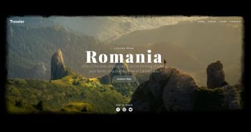
The free Traveler block is a block type slider. Actually, this isn’t a slider because it only has one slide without arrows or bullets. You can use this full width block as a header of your site. Put your links in the navigation, change the text, and your block is ready to use.
Layers
Heading, images and buttons. All of these layers display on the Traveler block, and every layer has their own place. This block is special, because it has a black background color, but there isn’t a background image. The image you can see is the background image of the Content layer. With this setting you can create the effect that the image is blurred from the background.

The block stays from 2 places: the navigation on the top and the content. The content is aligned in the center of the slide. There is a big heading, a description and a solid CTA. This button changes its color on hover, and you can navigate with that to another page. At the bottom of the block there are 3 images with social icons. This can be a good place to link to your social networks.
Animations
The free Traveler block doesn’t have any animations. If you want to create a slider from this block then you can change its slider type. Then you can add a main animation for the slider, which can be fade, vertical or horizontal.
Layout
Rows and columns are the best options to structure your layers. The basic layout stays from 2 rows. The top row has 2 columns in 25%-75% width. The left column is aligned to the left, and there is an image layer. Inside the right column there is another row with 4 layers which can be a great navigation of your site.

By default the social images should be right after the button. But there is the Stretch option enabled at the row, and that puts the images on the bottom of the slide.

Responsive
Device specific options have small device icons next to their name in Smart Slider 3. When you switch to mobile and tablet view, you can set these options device specifically. The textual layers are scaled to lower in tablet and mobile devices, and the padding was reduced.

🎓 Pro Version Available
Did you know this template has a alternative made with the Pro version of Smart Slider 3? What more do you get with the Pro template?
- Layer animation
- Parallax effect
Related Post: 10 Beautiful Full Width Slider Examples


