Slider Settings
The Green Energy template is a slider group. What makes slider groups special is that they can contain any number of sliders and blocks. They’re like folders, that let you export and publish a group of sliders together. Additionally, they help organizing your sliders in your Dashboard.
In this template you can find 4 blocks and 1 slider. If you’re wondering what’s the difference between a slider and a block, here’s a simple explanation. Blocks are special kind of sliders, that can only display one slide. This lets you take advantage of Smart Slider’s cool features on your website, without having to create an actual slider.
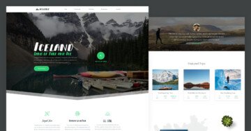
All sliders and blocks are full width in the Green Energy template. Full width sliders are popular, because they fill the browser horizontally. There’s another thing worth mentioning about the first block. It has a slide background video. Background videos, just like background images, are design elements that let you fill the whole slide area with your content.
Layers
Usually there are many sliders and blocks in a slider group. As a result, there are many different layers inside them as well. Of course, this template is no different. However, you can find the most popular layers, the heading, text, image and button layers here.
Animations
There are many layer animations in this template. Almost all blocks have some kind of special effect on some of their layers. For example, the menu on the first block appears with an incoming layer animation. Similarly, the text blocks in the Services section use a layer animation to appear.
Apart from the layer animations, there’s a lightbox in the first block. It opens up a video from YouTube when you click on the play icon.
Layout
The Green Energy template has many interesting layout solutions. Let’s highlight the two most interesting and see how they were built!
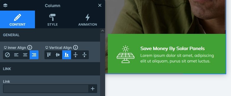
You can find the first interesting layout on the Invest block. It’s the green box that’s aligned to the bottom of the block. The base of the slider is a two column row, and this box (which is actually another row) is placed in the right column. The vertical align on the Column is set to bottom, and the row has a maximum width. This prevents it from filling the column horizontally.
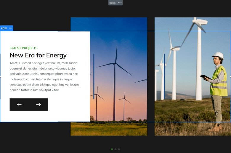
The other interesting layout that worth mentioning is the bottom slider. It’s navigation and textual content is on a Static Overlay. However, the images are on regular slides. Both the Static Overlay and the other slides have a three column row as their base. However, on the Static Overlay the first column, which has the content, is wider than the other two columns. This creates the kind of overlapping effect.
Responsive
Smart Slider offers many tools to create perfect looking sliders for mobile devices. Some tools, such as wrapping a row’s columns into new lines take effect automatically, although you can change it back if you need the columns to be next to one another. This behavior was quite useful in the Services block, which allowed the two columns to display below each other in the main layout. Also, the inner row, which contains the image and texts also wraps to more lines automatically.
But there are other options which you can adjust manually, such as the font size or the alignment. For example, on the first block the layers are aligned to the left on desktop, but they’re aligned to center on mobile.

Related Documentation: Slider Group
Related Post: How to Create Beautiful WordPress Landing Pages That Convert


