Settings
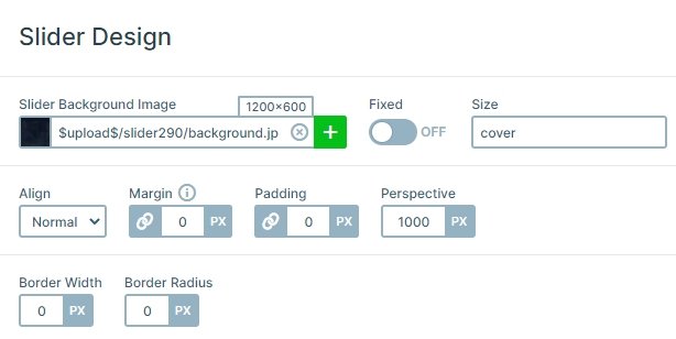
Minimalist websites and sliders aren’t going to go out of date. Why not spice up your website with a minimalist testimonial slider? On the slider above, you’ll find a nicely placed slider background image. It’s easy to recognize the slider background image. This image stays static while the slides move in front of them. To increase the legibility of the slides, we’ve darkened the background image. This high contrast allows the white texts to be read on each slide.

Layers
The slides have an image layer, which displays the customer’s picture. The images were rounded beforehand. Below each image there’s a text layer. It contains the testimonial text, the customer’s opinion on the product. The text color is white and the size is big, as this is the most important part of the testimonial slider.
At the bottom of the slide there are two heading layers: the top has the customer name. The bottom one, with lighter font color, reads their occupation. This isn’t crucial info, but it might be a great addition. For instance, if you sell products for athletes, you want to show which professionals are using it. This encourages the visitor to buy.
Animations
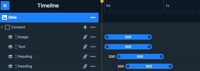
After the slides have switched, the layers reveal themselves by fading in from the right. This gives a small motion to the slides which makes them more interesting for visitors. You can manage the layer animations in the timeline, here you can copy and paste the animations, change the duration, or set the delay. Also, if you click on the animations, the layer window will open where you can see the other layer animation settings.

Layout
The slider has a simple structure: the layers are under each other. The arrows are in the left and right sides, and the bullets are on the bottom which gives a frame to the slider.
Responsive
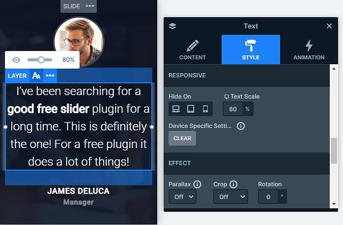
You can switch slides three ways: by arrows, bullets or dragging/swiping. This makes the slider mobile friendly. On mobile devices it’s more natural and convenient to swipe than to tap small elements. We’ve built each slide using default layers, which makes them behave better on small screens. For example, the texts are smaller on tablet and mobile. For that you can use the text scale option, which is device specific, so you can set different values on each device.

Related Post: Best Testimonial Slider Examples for WordPress
Related Post: Use Beautiful Layer Animations in Smart Slider 3 Pro


