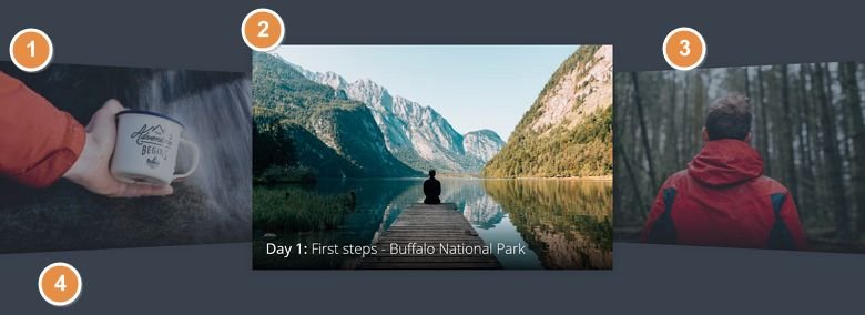
💡 Best features in this slider
- Previous slide – for navigation
- Active slide
- Next slide – for navigation
- Slider background, which creates the faded effect on the next and previous slide
Settings
A cover flow slider is a special kind of slider, that shows more slides next to each other. In Smart Slider 3 you can create a cover flow slider using the Showcase slider type. The Showcase slider type, like the cover flow sliders, displays a single slide in the middle, and am equal number of slides on its sides. Clicking on the slides on the sides will make the slider switch to the clicked slide.
The slides which aren’t in the middle have lower opacity. This makes them look they’re slightly faded out. Setting up such effect is very simple, and it can be done in just two steps. First, set a slider background color. Then, lower the opacity of the Before and After slides.
Layers
This slider focuses on the pictures, and the way the slider displays them. For this reason, there’s just a few layers on each slide. The most obvious layer is the text layer, which displays the white colored text. It accepts HTML codes for formatting the content inside. So, we made the “Day X” text on each slide bold using the HTML b tag.

Animations
The most spectacular animation on the Cover Flow slider is the actual cover flow effect. Although by default the Showcase slider type doesn’t look like a cover flow slider, it’s easy to set it up like that. This slider type has many cool animation settings, what you can play with to create an amazing effect.
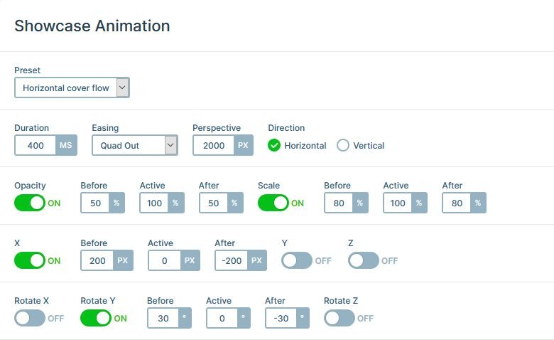
There’s also a basic incoming animation on the heading layer. The effect fades and moves in the layer from the right. The movement is subtle, but elegant.
Layout
Each slide has a row, which contains the text layer for the content. This row serves design purposes: it has a transparent to dark gradient background. As a result, it helps increasing the legibility of the text.

Responsive
The Cover Flow slider has two mobile specific changes. First, the text size was reduced to make it fit better to the slide. Second, we adjusted the paddings of the row and the Content layer. The paddings on the sides of the row are smaller on mobile, which allows the text to take up more horizontal space. Also, we set top padding on the Content layer. This makes the slider appear taller on mobile. As a result, the slides look more roomy.

Related Documentation: How to create an overlay for the slides?
Related Post: What Do You Need to Know About Slider Types?
