Settings
The Category Carousel slider is a great way to display your product categories. As a result your visitors can reach what they’re looking for in your store easily. This full width slider is a great choice for the home page of your website.
The slider uses the carousel type, which can display more slides next to each other. In fact, this slider shows up to 4 slides at the same time. The visitors can browse the slides in three different ways.
First, they can use the arrows on the left and right sides of the slider. There are bullets at the bottom of the slider, which is also a great way for navigation. To help touch screen user visitors browse in a convenient way, the slider also supports swipe navigation.
Layers
Each slide contains a row with one column. Inside this column there are two heading layers: one for the category title and for the product count. By default the layers appear in the middle of the slide, but here the row is bottom aligned. In Smart Slider the alignment happens from the parent element. So the row appears on the bottom, because the Vertical align on its parent, the Content layer, is bottom.
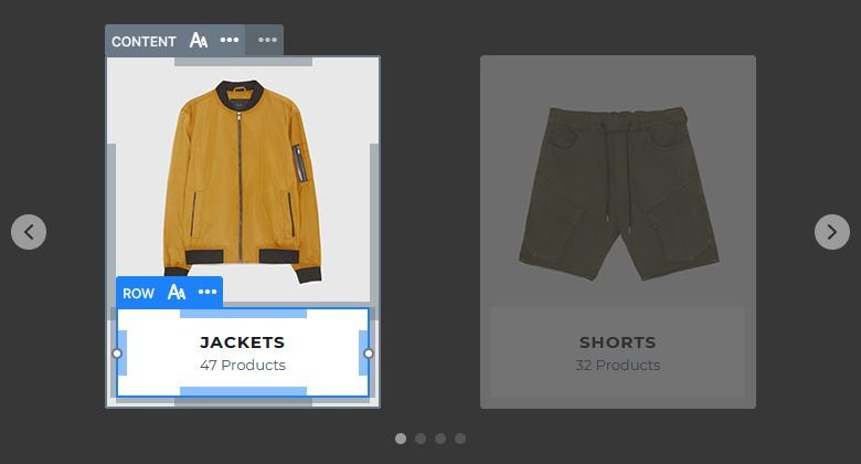
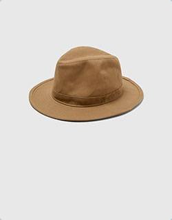
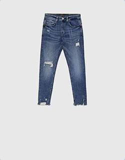
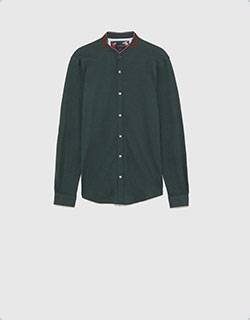
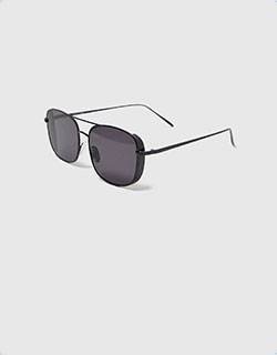
Each slide contains the category image for visual representation. But this image isn’t inside the row, in fact, it’s not even a layer. It’s the background of the slide.
Animations
There are no layer animations on the Category Carousel. In fact, the only animation you can see is the Main Animation, which runs on slide switching. It’s a neat animation that fits into any kind of websites.
Layout
As mentioned above, the Carousel slider can display more slides at the same time. The amount of slides the carousel can display depend on a couple of factors. Most importantly, on the set slide size and the current slider size. The narrower the slides are, the more can fit into the slider. So, if you want to display more slides in your slider, you need to lower the slide width.

Responsive
The carouse slider starts hiding slides if they can’t fit into the slider anymore. Generally on mobile devices the carousel slider displays a single slide. As a result, this one slide will look perfect on small screens. Additionally, usually there are no device specific changes needed to achieve this.
Related Post: Do you Need a Product Slider for your Webshop? Yes, you do!
Related Post: All You Need To Know About Carousel Slider Type


